Changelog
What's new, newest first.
July 24, 2026
- Notes. The non-to-do item has a proper name now: a Note — anything that's simply true over a stretch of time or just worth keeping (a vacation, a birthday, "focus for June"), as opposed to a task you tick off. The sidebar filter row reads Notes; nothing about your existing items changes.
- Turn a task into a note, and back. When editing any item, the "To do" switch is now live — flip it and Save to convert a task into a note (it loses its checkbox and stops competing for time) or a note into a task. Everything else — its time, tags, details, readings, history — stays put.
July 20, 2026
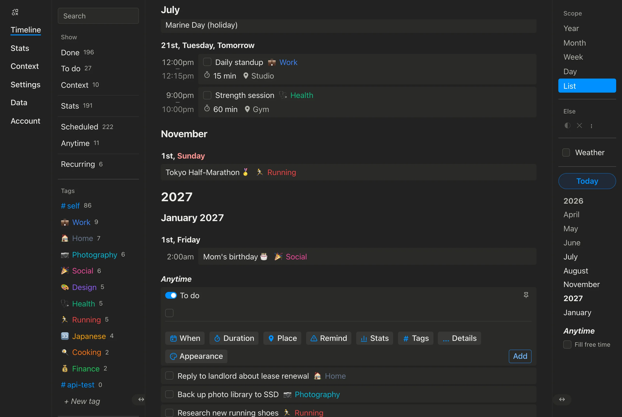
- Drag a timed item to change its time. In the list, drag a scheduled item — or a logged reading like your morning coffee — up or down within its day to give it a new time. As you drag it snaps to a tidy time right after whatever it's above lands (a whole hour if there's room, otherwise the half or quarter hour), taking durations into account — so what you see while dragging is exactly what you get. It only changes once you move it past another item, so a stray nudge won't alter its time. Drag it onto a different day and it keeps its time-of-day, just like before.
- The month sticks to the top. As you scroll the list, the current month's name now pins to the top of the view and stays there the whole way through that month, sliding up to the next month at the boundary. Day headings scroll along underneath.
- Cleaner, clearer headings. Day headings are shorter now — just the day and weekday (like "17th, Friday"), since the month is already pinned above. A month shows its year when it's not this year ("January 2027"), and the labels step up in size: the year biggest, the month next, the days at normal size.
- Timed items line up. In the day layout, every timed item now starts at the same left edge, so your schedule reads as one clean column instead of each day sizing its own time gutter.
- Double-click to edit — no more menu. The little three-dot menu on each item is gone. Double-click an item to open it for editing, where you'll now find Start, Delete, Cancel, and Save together. A reminder that's nagging you can be dismissed by clicking the reminder chip itself.
July 18, 2026
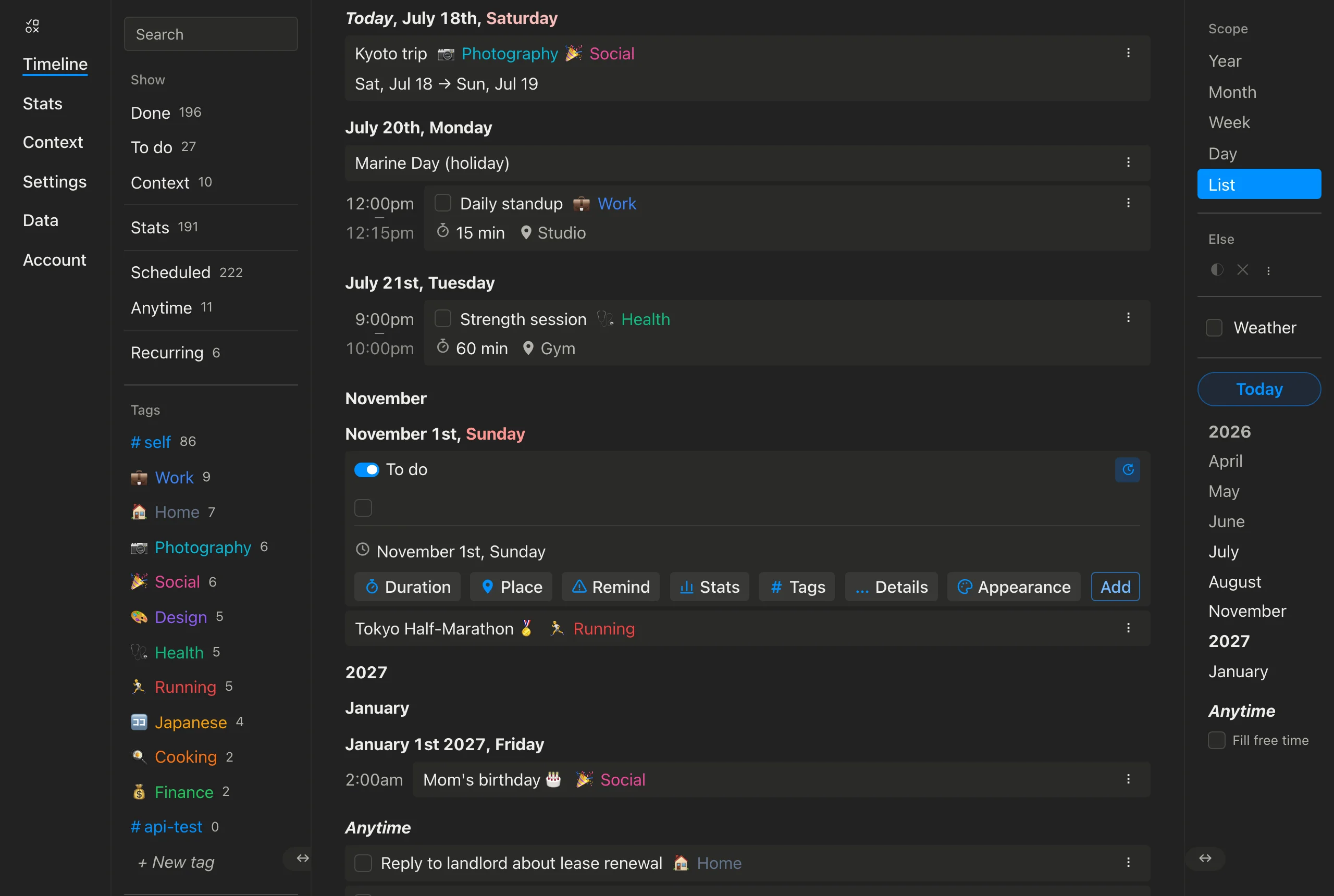
- Pin the composer. A small pin button in the composer's top-right corner keeps it on screen: once its spot on the timeline scrolls away, the composer sticks to the top or bottom edge of the view — flush with the edge, no jumping — so you can browse your timeline and still add things. While pinned, setting a date no longer scrolls the timeline away from where you were reading.
- A second press turns scrolling into a date picker. Pressing the pin again (it becomes a little clock) puts the composer in a mode where it rides along your timeline as you scroll — and whatever day, month, or year passes the middle of the screen becomes the new item's date. Scroll to next Tuesday, and the composer is there, set to next Tuesday; scroll to the Anytime section and the date clears. A third press unpins.
- A quieter Add button. The floating Add pill at the top now appears only when the composer is actually out of view (and lost its direction arrow) — click it to jump back to wherever the composer is parked. It sits exactly on the right edge of your timeline items.
- Tidier Places and Stats menus. The Places and Stats lists in the left menu now match the Tags list: just the colored name and its count — no checkboxes, no icons. Click a name to filter by it; the highlight shows what's active.
July 17, 2026
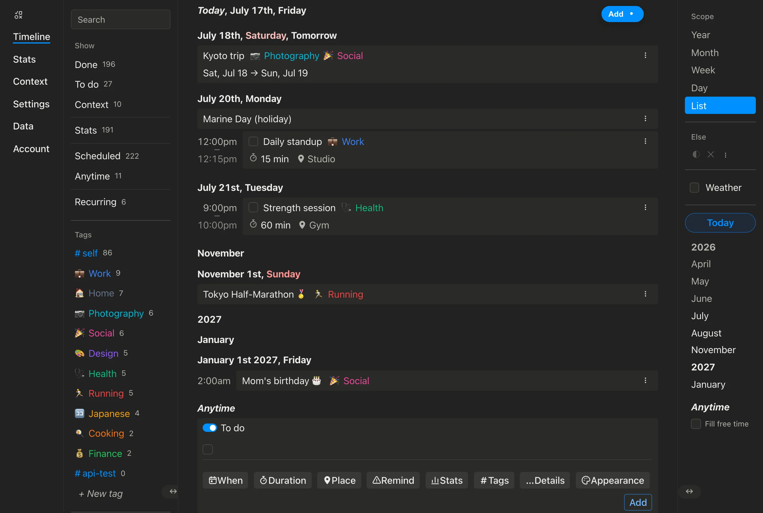
- The composer now looks like the item you're making. Adding a task shows a live preview of the row it will become: a precise time sits in the hour column on the left (just like a scheduled item), and every detail you set — duration, place, reminders, readings, tags — appears as a small chip exactly where it will sit on the finished row.
- Editing details happens in little menus. Click any chip (or the time on the left) and a compact menu opens right there to change it; the buttons below the preview add the details you haven't set yet. No more big panels unfolding inside the form — the composer stays the size of a row.
- A tidier Add. The Add button moved to the end of the buttons row, in its own spot on the right, and the composer lost its blue outline — it now reads as just another row on your timeline.
- New icons. Hand-drawn icons across the composer's buttons: a day calendar for When, a stopwatch for Duration, a map pin for Place, an alert triangle for Remind, a bar chart for Stats, and a palette for Appearance. They scale with the text around them and pick up its color, so they look right everywhere.
- The same icons on your timeline items. Every item's little detail chips now use them too: a clock before a scheduled time, the stopwatch before a duration, the pin before a place, the alert triangle on reminders, and the bar chart on readings — so an item reads the same in the composer, on the timeline, and in the side menu.
- Fixed: repeating items could vanish after a reload. If you reloaded while scrolled somewhere in the future, a repeating item whose next occurrence fell between today and that spot could quietly disappear from the list until you scrolled fresh. Repeating items now always show up, wherever you left off.
July 10, 2026
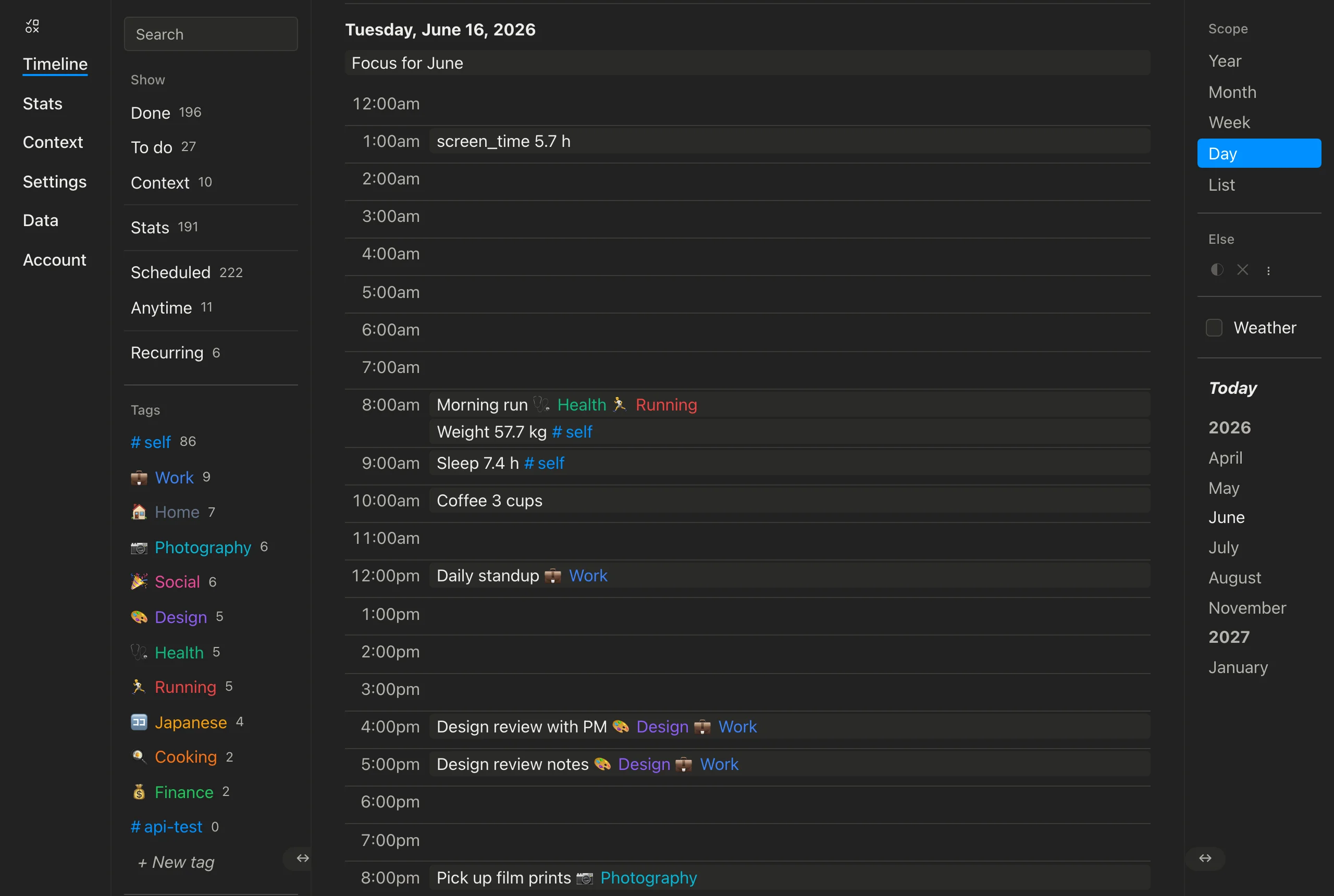
- A new Day view. The timeline's Scope control now offers Day alongside Year, Month, Week, and List. It lays a single day out hour by hour — midnight to night — with all-day items (a birthday, a trip, “focus for June”) across the top, everything you've scheduled sitting in its own hour, and a line marking the current time on today. It's the calendar zoomed all the way in to one day.
- The old “Day” scope is now “List.” The plain chronological rundown that used to be called Day is renamed List — the same view, a clearer name now that Day is its own calendar layout. Your timeline opens on it just like before; there's nothing you need to change.
- Fixed a Safari crash when scrolling the timeline. Scrolling the List up and down quickly in Safari could crash the app. That's fixed — scrolling stays smooth however fast you go.
July 6, 2026
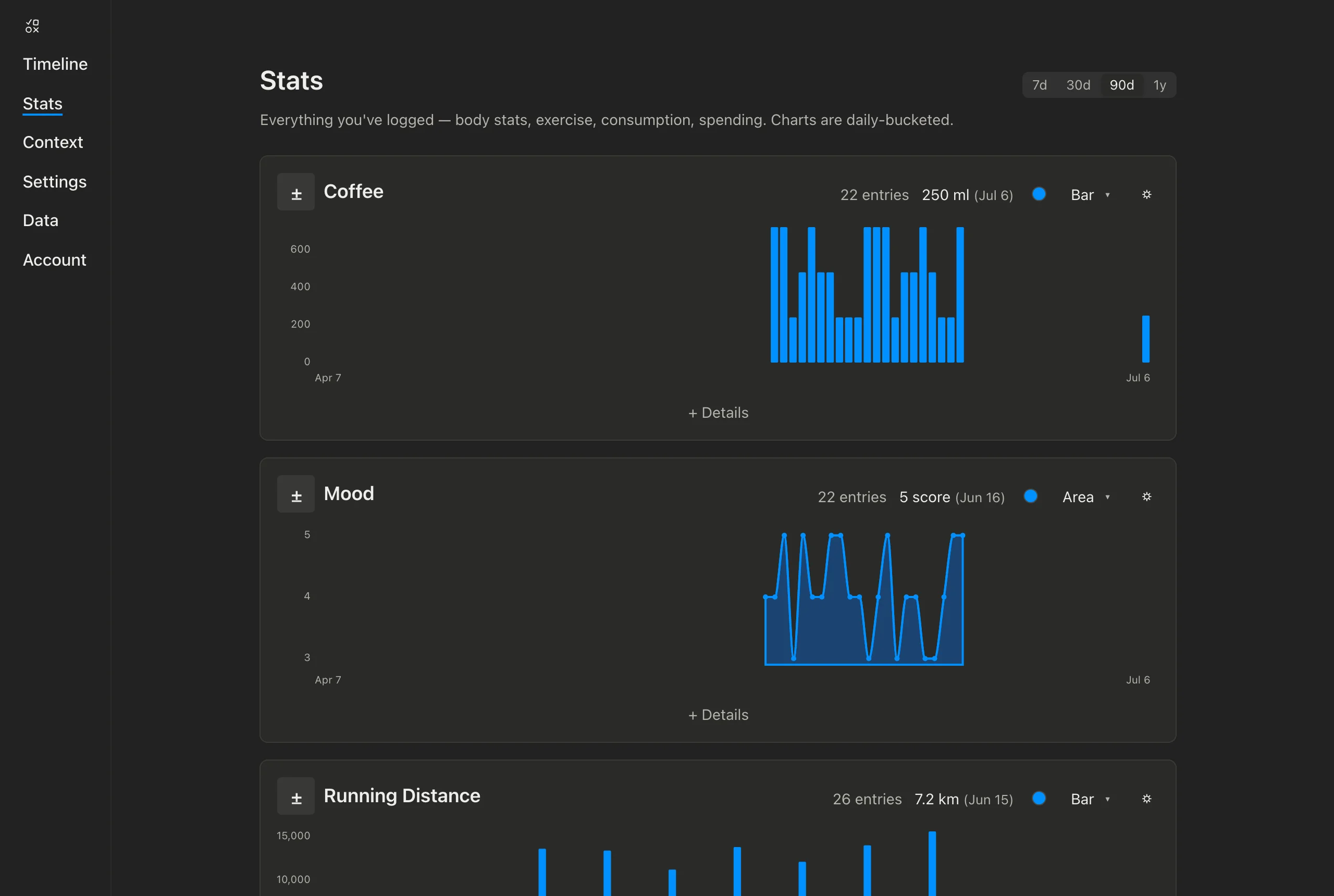
- “Logs” is now “Stats.” The page that charts everything
you track — weight, sleep, coffee, spending, and the rest — is now
called Stats and lives at
/app/stats(your old/app/logsbookmark redirects there). The nav link, the composer's quick-entry mode, and the timeline filter all read Stats now. Nothing about your data changed — every reading you've recorded is exactly where it was; only the name is new. You still log a measurement — that's the act; a Stat is the thing you're tracking. - Heads-up for API users: the rename is a clean break.
The REST routes moved from
/api/v1/logs…to/api/v1/stats…, the token scopes are nowstats:read/stats:write, and data exports use a new format version. If you built an integration against the public API, update those before your next call.
July 3, 2026
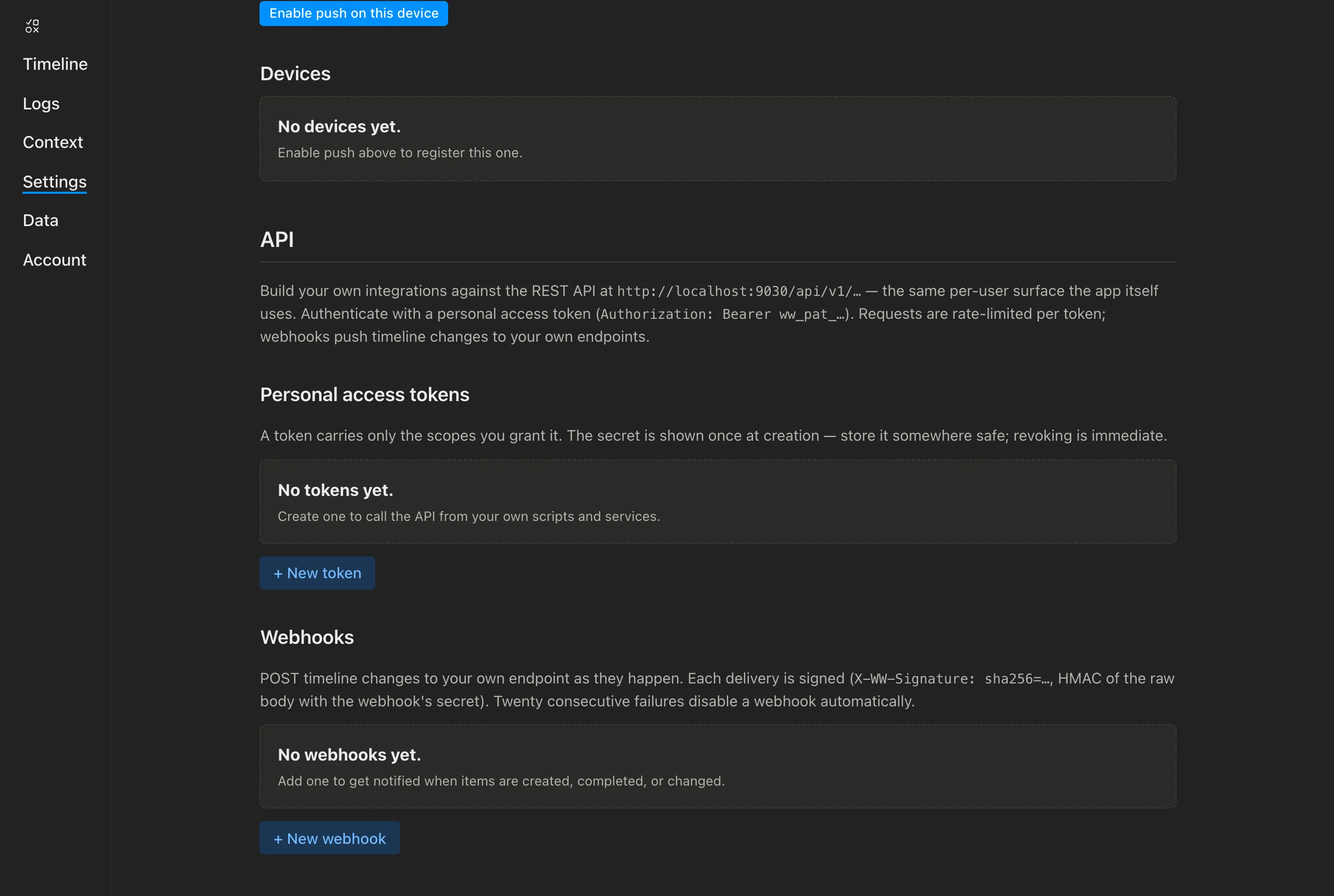
- Build your own integrations — the public API is here.
Every account can now mint personal access tokens from
the new Settings § API section and call the REST API
at
/api/v1/…— the same per-user surface the app itself uses: timeline, tasks, context, tags, places, measurements, logs, goals, reminders, search, export. Each token carries only the scopes you grant it (read/write for items and logs, webhook management), can expire, and is revocable in a click — the secret is shown once at creation. Requests are rate-limited per token. - Webhooks push your timeline changes to you. Register
an endpoint (also in Settings § API) and get a signed POST whenever an
item is created, updated, completed, reopened, started, abandoned, or
deleted — or a measurement is logged. Every delivery carries an
X-WW-SignatureHMAC you can verify with the webhook's secret, there's a one-click test delivery, and a webhook that fails twenty times in a row disables itself instead of hammering your server. - The Show filter is simpler and clearer. The menu's Show section drops the checkboxes and the "All" row for a plain list of toggles: Done · To do · Context, then Logs, Scheduled · Anytime, and Recurring. Pick as many as you like — options in the same group widen the view (Done or To do), options across groups narrow it (Done and Scheduled). So Context + Logs now means "context items that carry readings," not "either one." Selecting a whole group (e.g. Done + To do + Context) just resets to showing everything, and Recurring and Anytime can't both be on at once (a recurring item is always scheduled).
- Every Show row now shows a count. A muted number next to each row tells you how many items match — how many are done, scheduled, recurring, and so on.
- Hide just one kind in a click. Each Show row's ⋯ menu has a "Hide" action that shows everything except that kind — handy for tucking away completed items while keeping the rest.
- Weather and "Fill free time" moved to where they belong. The Weather toggle now sits at the top of the Places section, and the Fill free time checkbox rides right on the timeline's Anytime heading — next to the tasks it actually affects.
- One "Else" dial decides what happens to everything you filtered out. Whatever you select in the menu — Show kinds, tags, places, logs, in any combination — a single Else ◐·✕ control decides the fate of everything that doesn't match: ◐ dim keeps it on the timeline at half size in grayscale (select "To do" and your done items become a quiet backdrop instead of vanishing), ✕ hide is the classic filter. It lives on the right-side rail under its own "Else" label, between the Scope tabs and the month list, with a ⋯ beside it to restyle the dimmed look. Works in the calendar views too — which now respect the Show filter as well. The timeline's date labels, hours, and checkboxes shrink along with fully dimmed days. (Per-tag dim/hide dials were tried and dropped the same day — one dial for everything beats seven.)
- A tidier menu, on both sides. Sections in the left menu and the right rail are now separated by matching hairline rules, with one quiet small-caps-style heading look shared across both. Tag rows are back to a simple click-to-focus list (the ⋯ edit button shows on hover), item counts sit right after each label instead of hanging at the far edge, and the little ⋯ menus everywhere stay hidden until you hover. Filter controls moved inline with their headers: Show clear, Tags any·all ✕ (the match toggle appears once a tag is focused), a plain ✕ on Places and Logs. The Weather toggle now lives on the right rail, right under the Else dial.
- Checking things off is snappier and sturdier. The completion checkbox flips the instant you click it (no more waiting on the server round-trip), and a long-standing bug is gone: completing a repeating task's first occurrence used to quietly not stick — the box would bounce back and the series never moved on. It completes and advances properly now.
July 2, 2026
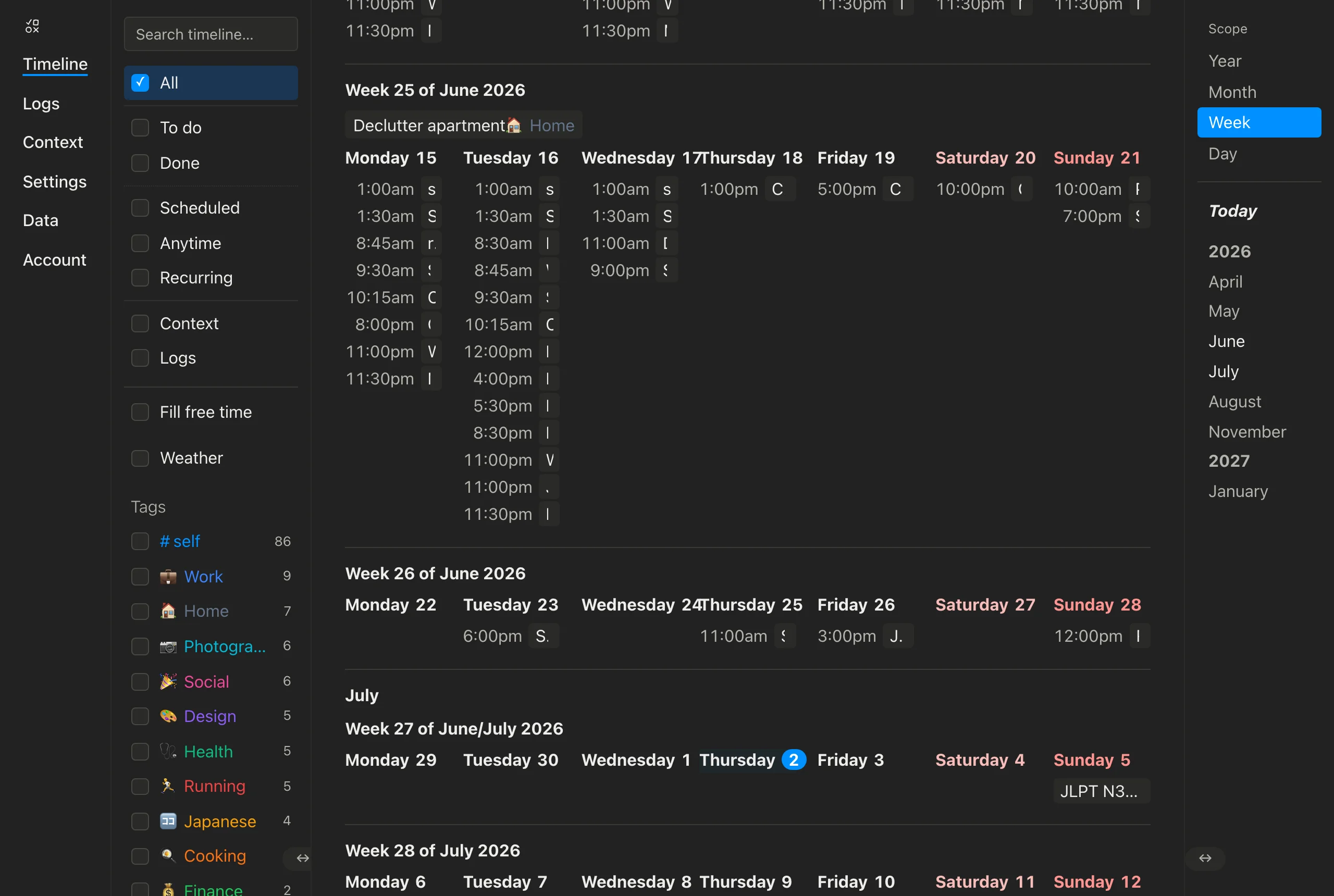
- The Timeband shows where you are by type, not tint. The month/year rail on the right now marks your viewport with the labels themselves: every label is the same size, and only the colour changes — bright while it's on screen, muted when it isn't. No more background pill. A year lights up only while its own label is in view.
- A Today button on the Timeband. A bold Today button sits above the month list and jumps straight to today's heading from anywhere — it also no longer gets confused by unscheduled items into stopping at the Anytime section.
- The Month calendar is now a real calendar table. Each month renders as a bordered 7-column grid: a weekday header row on top, day cells that show their items with times (just like the Week view), and rows that grow only as tall as their content. Month-wide items sit as chips under the month label, and a week's own items head that week with a clickable "Week N" label that jumps to Week view.
- Week view marks new months and years. The first week of a month gets a month label above it (and the first week of a year a year label), with that month's or year's items listed once underneath — instead of repeating in every week they span. Both labels are clickable to zoom out to Month or Year view, and day headers (now "Tuesday 9", bold) click through to the Day view.
- The Year view got cleaner. Everything is the regular text size, whole-year items sit as chips below the year label, day cells are roomier with the numbers on the left, and the heat colours now count everything on a day — tasks, notes, events alike.
- Every view lines up the same way. All four scopes share the same side spacing, the same slim scrollbar, and the same bottom breathing room — switching between Day, Week, Month, and Year no longer shifts the content around.
- Swipe-to-go-back works in the Day view again. A horizontal trackpad swipe over the list was being swallowed; it now triggers the browser's Back/Forward navigation like everywhere else.
July 1, 2026
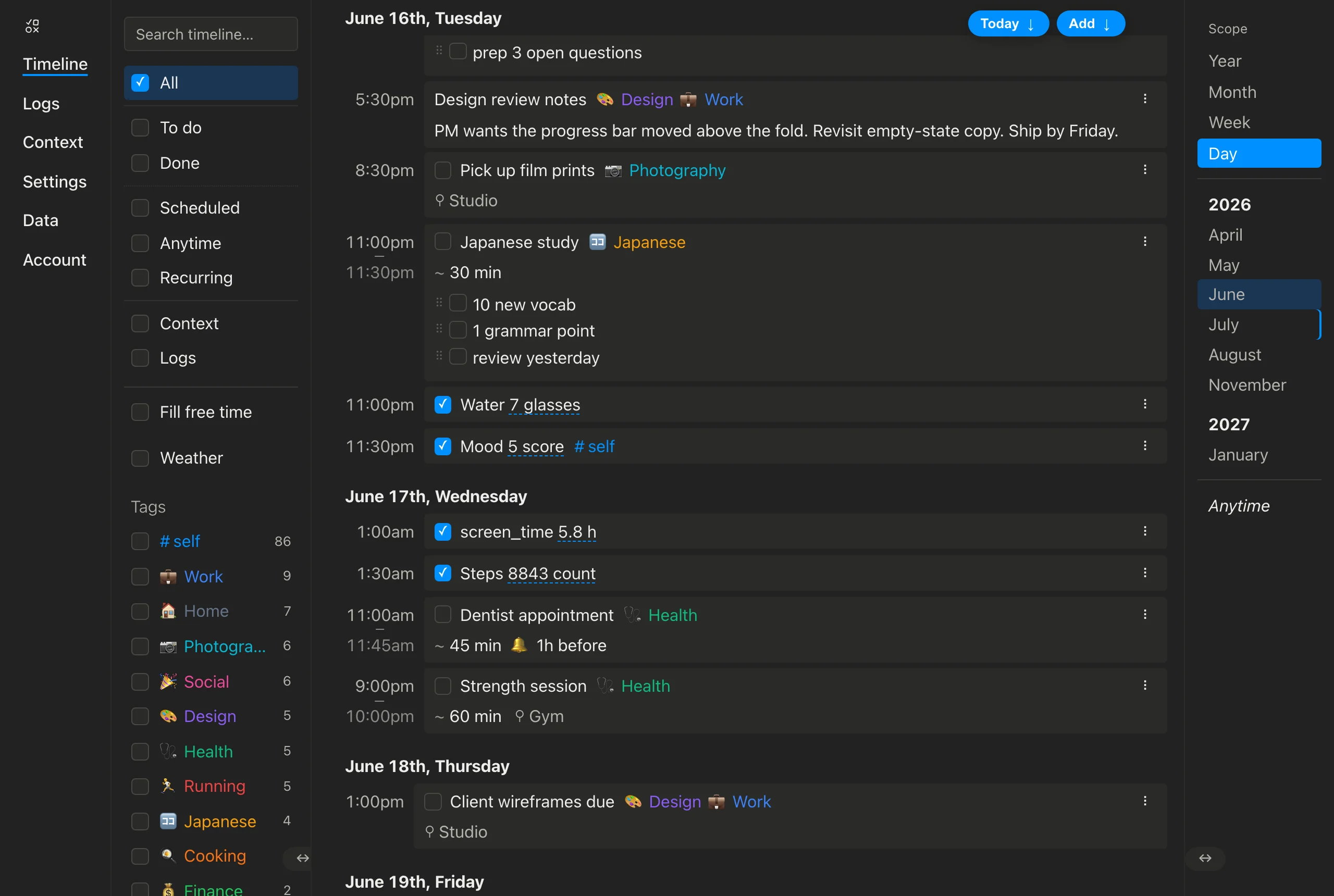
- Times line up in a column in the Day view. Anything with a set time now shows that time in a tidy column down the left, next to the item — so a day reads like an agenda. Things without a time (all-day items, notes, the add box) sit at the top, right under the day heading.
- End times show under the start. If an item has an end time or a duration, its finish time appears on a second line just below the start, with a little dash between them.
- Tap a month, week, or year heading to zoom out. In the Day view, clicking one of the month, week, or year headings switches to that calendar view, landing on the period you clicked.
- Consistent scrolling everywhere. The Day list now uses the same slim scrollbar as the Week, Month, and Year calendars, so scrolling feels the same across the whole timeline.
June 30, 2026
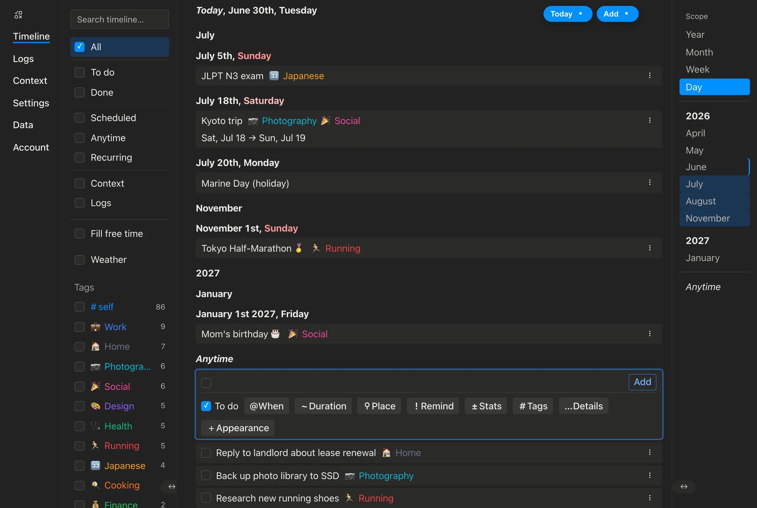
- Your list and calendar are now one view. Instead of switching between a separate "List" and "Calendar", there's a single Scope control on the right — Year, Month, Week, Day. Day is your familiar timeline list; Week, Month, and Year show it as a calendar. It's the same items either way — just zoomed in or out.
- Switching keeps your place. Moving between the list and a calendar — or clicking a day in the calendar to open it — now lands you where you were looking instead of jumping back to today.
- The view and density controls are gone. The old List/Calendar toggle and the empty-time "density" options were removed in favour of the one simpler Scope control.
June 29, 2026
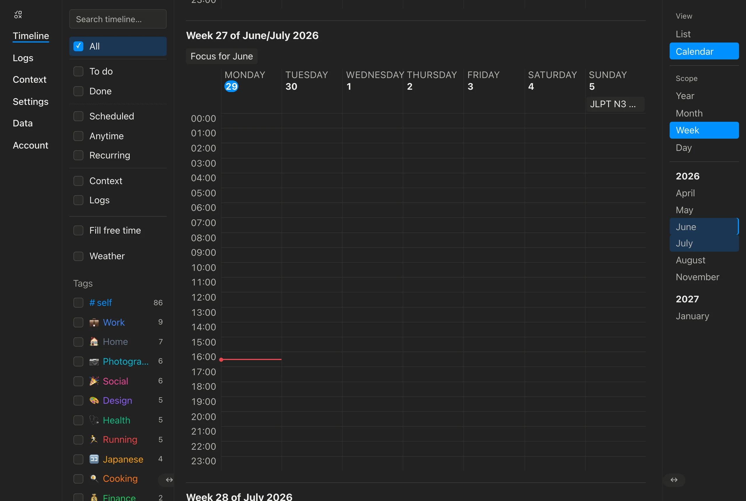
- The Week and Day calendars have been rebuilt. They're now a clean, simple grid at the normal text size — the hours run down the left, each hour is a comfortable row, and the day scrolls smoothly from one to the next instead of being squeezed onto a single screen. The day-of-week labels sit on the left, all-day items appear at the top of each day, and hovering a day (or, in Month view, a week) highlights the whole column or row.
- Calendar items show their own look. Across every calendar view, each item now appears in the same colours, styling, and tags as it does in your list, so a calendar entry looks just like a small version of its row.
- The Week view tells you which week you're on. Each week leads with a heading like "Week 27 of June/July 2026", and anything scheduled for a whole week (or month/year) is listed above the days.
- The month calendar has a cleaner look. The days now form one connected grid with thin shared gridlines instead of separate boxed-off cells, days that belong to a neighbouring month are simply left blank, and a light rule separates one month from the next.
- Whole-week items show up in the month — click to open the week. Anything scheduled for a whole week now appears in a slim "Week 25"-style strip across the top of that week's row, and clicking it opens that week in Week view.
- The month calendar scrolls more smoothly. Months are no longer redrawn as you scroll past them, so it stays fast however far you go.
June 28, 2026
- The Year calendar is much smoother. Scrolling through years and loading new months no longer drags — especially on big screens. The colour tints are worked out once per year instead of for every single day, each mini-month skips the blank days that belong to neighbouring months, and years now appear at exactly the right size as you scroll — no more jumping or sliding as new months load in (this was especially rough in Safari).
- Going back keeps your place in the calendar. Scroll partway into a year, open a month to look closer, then hit Back — the Year view reopens right where you left it instead of jumping to the top.
June 27, 2026
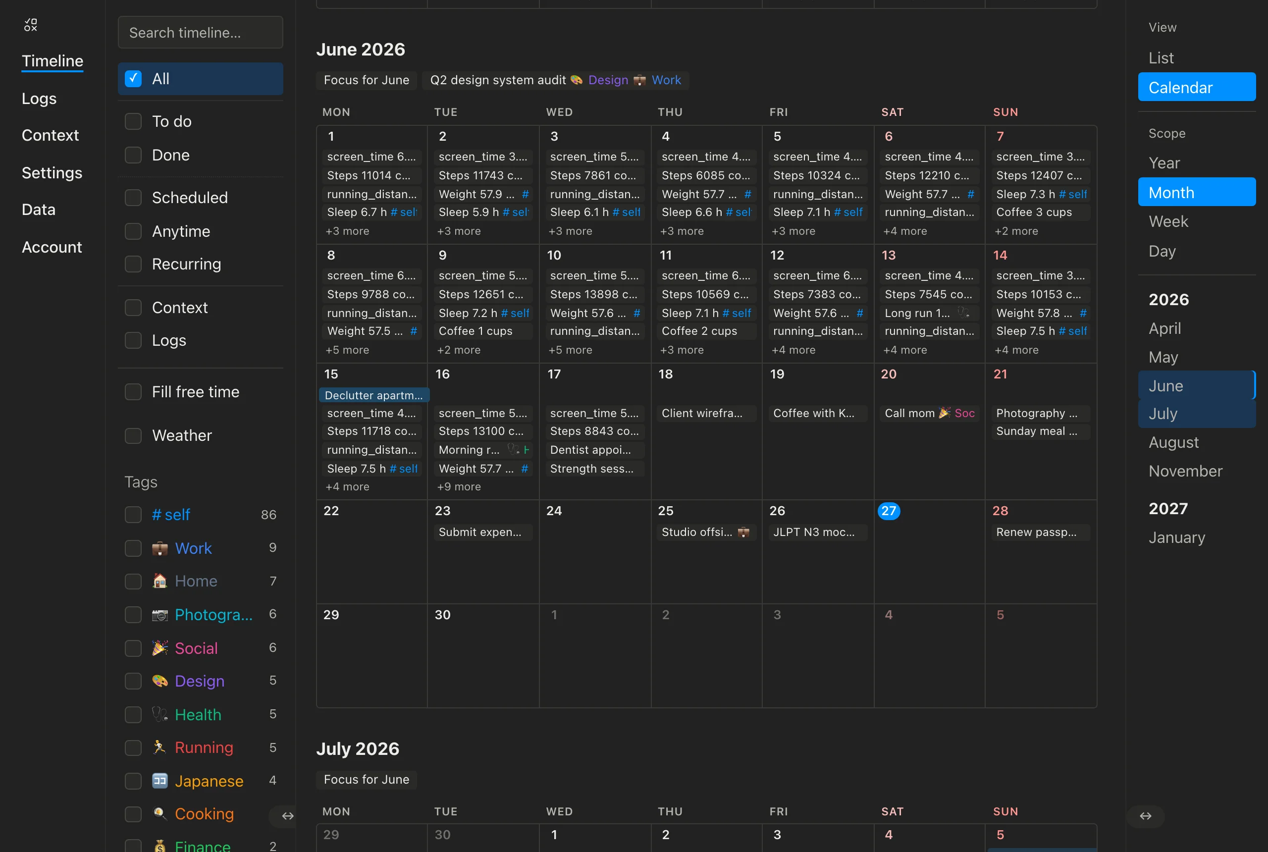
- The month calendar shows tasks the way the list does. Every item in a day cell now looks just like its row in the list — same colours, same tags — only smaller. Anything scheduled for a whole month sits neatly under the month's name instead of stretching in a bar across the grid, and days from the neighbouring month are simply greyed out rather than shaded a different colour.
- Back and forward work in the timeline now. Switch between List and Calendar, drill from a year into a month into a day — your browser's Back button (or swipe-back) retraces every step and returns you to exactly where you were, the date and all.
- The calendar scrolls smoothly now. Scrolling into the past or future no longer gets stuck drawing endless empty months or jumps you back to the top — only the part you're looking at is rendered, so it stays fast however far you go.
- The calendar — and the dates you can put on a task — now run from 2000 all the way to 2099.
- The minimap navigates the calendar. Click a month or year on the right-hand rail to jump straight there, and it highlights the months you're currently viewing so you always know where you are.
- Tidier Year view: every day is a clean square, a thin line now separates one year from the next, the weekday letters are smaller and quieter, and anything scheduled for a whole month — or a whole year — now sits inline right next to the month or year's name.
- Scrolling up no longer nudges the calendar. When you scroll back into earlier years, the new months load in off-screen and the view stays put — no more jump or jiggle as content appears above.
- Birthdays and other background events now show in the calendar. A recurring birthday could be missing from a year's view entirely; now it appears every year, and the Year view marks any day with a background event with a small dot — so a month whose only entry is, say, a birthday no longer looks empty.
June 26, 2026
- Fixed Safari reloading the app on its own. On a long timeline, Safari could decide the page was "using significant energy" and reload the tab. Behind the scenes the drag-and-drop machinery was constantly re-measuring every row even when you weren't dragging; now it only does that work during an actual drag, so the app sits quietly when idle.
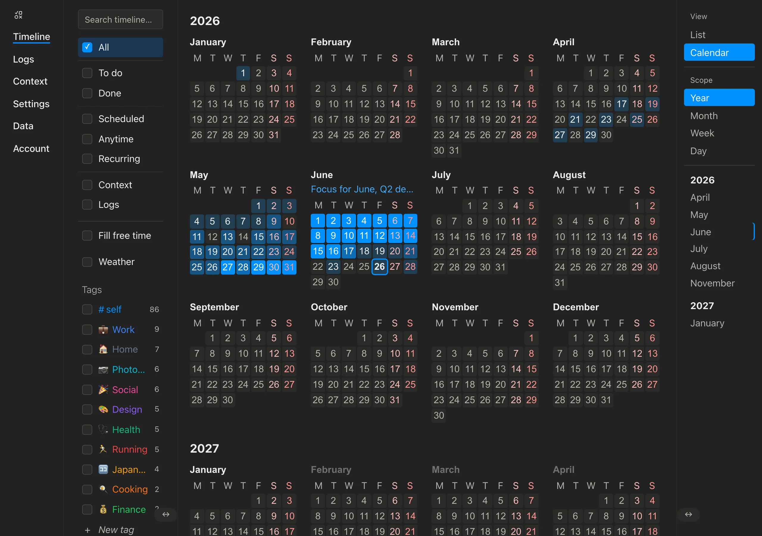
- The timeline's grid grew up into a real calendar. Switch to Calendar from the minimap, then choose Year, Month, Week or Day — each lays your time out the way you'd expect.
- Year — all twelve months at a glance, every day shaded by how busy it is (a heatmap). Click a day to open it, or a month name to open the month. The grid fits as many months per row as your window allows (one, two, three, four, six, or all twelve), weekends read in red, and anything scheduled for a whole month is listed in one line right under the month's name.
- Month — the familiar month grid: one line per item with a "+N more" when a day is full, and multi-day things (a trip, a focus for the month) drawn as a bar stretching across the days they cover.
- Week & Day — an hour-by-hour view with timed items placed by their start and sized by how long they take, overlapping items sitting side by side, an all-day strip and an "anytime" tray up top, and a line marking right now.
- Scroll up or down to move through time; switching scope jumps you back to today. Click any day to drop into it. Once you scroll past your very first or last item the calendar keeps flowing through empty periods — drawn instantly, with their labels dimmed so you can tell there's nothing there.
June 25, 2026
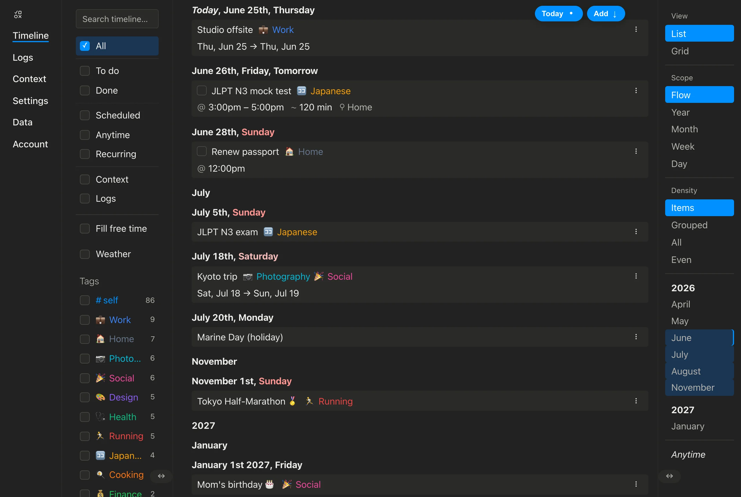
- A cleaner, tidier item — the checkbox now sits right next to the title, and an item's details (time, duration, place…) line up in their own row just below, flush to the left edge. A little more breathing room before the tags, too.
- Grab an item anywhere to move it — the little drag handles are gone; just pick up a row by its body to reorder or reschedule it. While you drag, the item stays the same size and simply lifts with a soft glow.
- A calendar view for your timeline — switch between the classic list and a grid from the top of the minimap. Pick a Scope and time lays out as a calendar: a year reads as a row of months, a month as a row of days, a week as its seven days, a day as its hours. Same items, same actions.
- Everything works right in the grid — tap a slot's + to add to it, drag an item onto another slot to move it, and hover a cell to edit, complete or remove what's inside. It opens on today, and scrolls sideways when there are more columns than fit.
- A new Density control sets how much empty time you see — from just your items, to gaps grouped together, to every slot shown, to an even time-grid where every slot is the same size. It works the same in the list and the calendar.
- A Scope control groups your timeline. In the list it draws a divider line only at the level you pick — months, weeks or days — and hides them otherwise, so the list stays clean by default. In the calendar it sets how the rows are split.
- Tidier tags — a tag that wraps onto a second line now lines up with the text above it instead of being nudged in.
June 24, 2026
- Cleaner timeline dividers — a thin line now sits between every section (years, months and days each get their own), and the lines scroll away with the page instead of sticking under the date heading.
- Offline and "new version available" messages now look and behave the same — tidy pills that pop up from the bottom and wrap neatly on any screen width.
- Sidebar tidy-up — the menu's scrollbar is slimmer and tucks to the left, appearing only when you hover; the search box lines up with the rest of the menu; and the menu and minimap resize handles moved to the bottom, sitting on their dividing line.
June 23, 2026
- Checklists and lists in an item's details are now drag-to-reorder — grab the handle on any line and drag it up or down within its list. Plain bullet and numbered lists work too (and renumber themselves).
- The timeline remembers where you were — reload the page and it scrolls right back to the spot you left off (and refocuses the composer if you were typing). There's also room to breathe at both ends now, so the very first or last item can sit in the middle of the screen instead of sticking to an edge. A fresh visit still opens on Today.
- Places that fill in a map now save themselves — pick a place from the search or drop a pin, and it joins your Places list automatically, just like tags. Freeform notes-to-self don't clutter it.
- A friendlier place picker — search for an address right in the composer (results appear as you type) and toggle a map open inline to drop a pin, no popup.
- Every composer menu now works the same way — When, Duration, Place, Remind, and Tags all share one tidy layout with quick-tap chips and a single text field. Tags are tap-to-add (tap again to remove), and you can stack several reminders on one item.
- Looser time typing — 9am, 9:30pm, noon, and tomorrow 9am all just work now, not only 24-hour times.
- Notes/details on an item are now a second writing area right under the title — it grows as you type and reads like the finished note.
- Repeating items, in plain words — type or tap an every time into the "When" field: every day, every Monday, every Sunday at 3pm, every January, every 15th, every weekday, every 2 weeks. A time like "at 3pm" now schedules each occurrence at 3pm.
- Smarter "When" shortcuts — picking a time after a day keeps the day (tomorrow + 4pm stays tomorrow), and the shortcuts show only the options that make sense.
June 22, 2026
- A changelog — this page. See what's shipping, newest first.
- Unified composer — Task and Context now share one accordion card, with a single editable time chip for "When".
June 19, 2026
- One timeline, one kind of entry — every item is simply an act (something you do) or context (something true over a span). The old Event/Note split is gone.
June 18, 2026
- Timeline density control — collapse empty stretches of time to month, day, or hour from the Timeband.
- One-click jump back to today.